

Rule of Thirds
The Rule of Thirds is one of the most widely recognized guidelines for organizing composition in painting, drawing, and photography. It uses a simple division of the picture plane to help artists consider subject placement, relationships between visual elements, and visual balance.
Despite its name, the Rule of Thirds is not compulsory. It is a compositional guideline that offers one way to explore an image’s organization. Following it does not, by itself, guarantee a good picture.
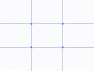
The geometric principle
The picture plane is divided into three equal sections horizontally and vertically. Two vertical and two horizontal lines create nine equally sized rectangles and four intersection points.
For a picture of width W and height H, the lines are located at:
- Vertical: x = W/3 and x = 2W/3.
- Horizontal: y = H/3 and y = 2H/3.
On a 60 × 40 cm canvas, for example, the vertical divisions lie 20 and 40 cm from the left edge. The horizontal divisions lie approximately 13.33 and 26.67 cm from the top edge.
The same construction works with horizontal, vertical, and square formats. What changes is the aspect ratio of the nine resulting areas.
How the guideline works
The Rule of Thirds encourages the artist to explore alternatives to placing every major element at the center. In its familiar modern interpretation, important subjects, details, and boundaries between large visual areas are placed near a third line or an intersection.
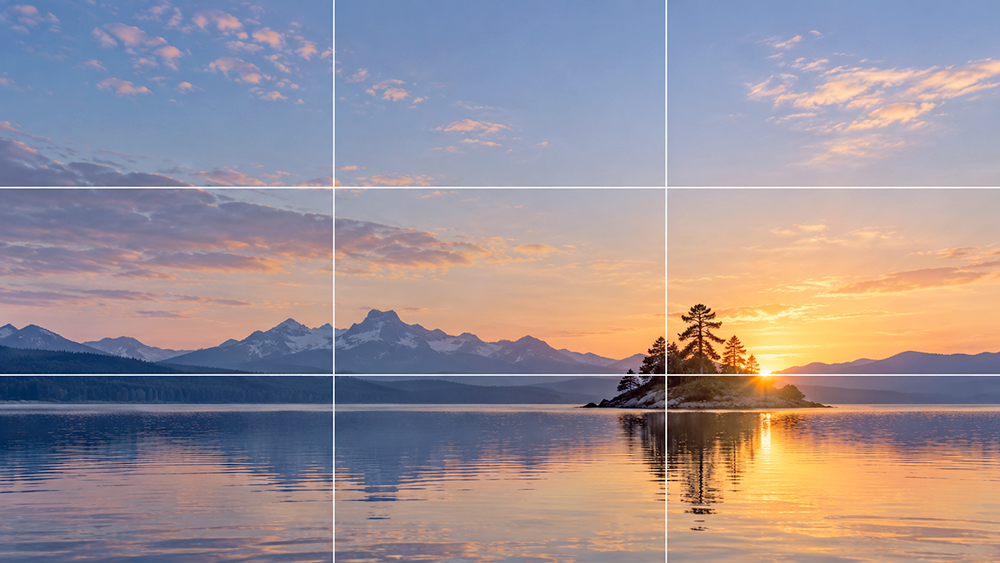
This does not mean that every object must lie precisely on a line. In a portrait, an eye may approach an upper intersection. In a landscape, the horizon may align with a horizontal third. In a still life, the visual center of the principal group may fall near a vertical third.
Geometric balance is not the same as visual balance. A small dark shape, a bright color accent, and a broad light area may carry very different visual weights. The grid cannot resolve those relationships automatically.
Historical background
The term Rule of Thirds is historically associated with the British artist and engraver John Thomas Smith (1766–1833). In his 1797 book Remarks on Rural Scenery, he discussed unequal proportions within a picture, including relationships between light and shade, land, water, and sky [1].
Smith argued for approximate one-third and two-thirds divisions rather than mechanically splitting visual areas into equal halves. His discussion was not a complete description of today’s familiar 3 × 3 grid with four intersection points [1, 2].
It would also be inaccurate to claim that Smith invented asymmetrical composition. His contribution is associated with naming and discussing the principle, not with being the first artist to use unequal divisions.
Practical applications
Landscape painting
In a landscape, the third lines are often useful when considering where to place the horizon. If the sky is the main subject, the horizon can be lowered toward the bottom third. If land, vegetation, or foreground detail is more important, it may be placed nearer the upper third.
In either case, value, lighting, color, and the relative importance of subjects must also be considered. A horizon placed exactly on a third line is not automatically effective.
Portrait and figure painting
In a portrait, an eye or another significant facial feature can be placed near the upper third. If the sitter turns to one side, allowing additional space in the direction of the gaze can establish a useful relationship between the figure and its surroundings.
Lighting, silhouette, pose, and intended emotional effect matter more than perfect alignment. A central composition is often appropriate when the artist wishes to emphasize frontality, symmetry, or stillness.
Still-life painting
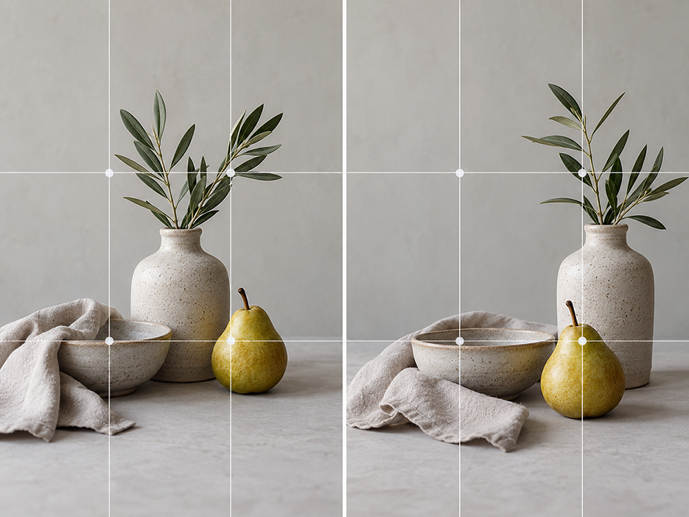
In still life, the grid can help the artist test the location of the principal group and its relationship with the surrounding space. A tall object might stand close to a vertical third, while smaller objects provide a visual counterweight.
The overall silhouette, overlapping forms, cast shadows, and negative space matter just as much as object centers. Three objects placed precisely at three intersections do not necessarily make a strong composition.
When the guideline is less useful
Mechanical use of the Rule of Thirds can become restrictive. Other structures may be more appropriate when a picture is built around:
- pronounced symmetry or a central axis
- repeated rhythm or ornament
- radial or concentric forms
- complex overlaps between shapes
- deliberately static, frontal arrangements
A central cross, a diagonal framework, or another geometric structure may provide a better analytical guide in these situations. The composition should serve artistic intent, not the other way around.
What research suggests
The relationship between the Rule of Thirds and aesthetic judgment is not straightforward. A 2014 study in Art & Perception found only a weak correlation between aesthetic ratings and viewers’ subjective judgments of compliance with the rule. Aesthetic ratings did not correlate with the researchers’ calculated rule-of-thirds measure [2]. The findings do not support treating the rule as a sufficient predictor of image quality.
A separate 2014 study showed that the position of particular landscape elements and the horizon can influence viewers’ preferences. The results also depended on whether the element itself was perceived positively or negatively [3].
A 2022 statistical analysis described highly rated photographs with intentionally centered subjects or horizons [4]. Together, these findings suggest that image content, relationships between elements, and artistic purpose matter more than compliance with any single grid.
Practical exercise
Select three objects of different sizes and arrange a simple still life. Make three small compositional sketches.
- Place the main object near the center in the first sketch.
- Move the principal group toward a vertical third line in the second.
- In the third, adjust both the main group’s position and the placement of smaller objects. Pay attention to the negative spaces.
Compare the resulting silhouettes, visual weight, light and dark masses, and the movement of the eye. The purpose is not to prove that one layout is superior. It is to observe what changes when subjects move within the picture plane.
Conclusion
The Rule of Thirds is a simple way to begin organizing the picture plane consciously. It can encourage exploration of asymmetrical balance and make proportional relationships easier to evaluate.
A strong composition, however, depends on more than the distance of subjects from grid lines. Value relationships, color, shape, scale, rhythm, and artistic intent remain essential. The Rule of Thirds works best as one analytical tool among several, not as a formula that every picture must follow.
Sources and further reading
[1] Smith, John Thomas. Remarks on Rural Scenery. London, 1797. Wellcome Collection.
[2] Amirshahi, S. A., Hayn-Leichsenring, G. U., Denzler, J., Redies, C. Evaluating the Rule of Thirds in Photographs and Paintings. Art & Perception, 2(1–2), 163–182, 2014.
[3] Does the Composition of Landscape Photographs Affect Visual Preferences? The Rule of the Golden Section and the Position of the Horizon. Journal of Environmental Psychology, 38, 143–152, 2014.
[4] Wang, J., Lee, M. A., Lee, T. C. M. When Might We Break the Rules? A Statistical Analysis of Aesthetics in Photographs. PLOS ONE, 17(7), e0269152, 2022.