

Center Cross
Axes, Symmetry, and Visual Balance
The Center Cross is one of the simplest compositional guides: one vertical and one horizontal line divide the picture plane through its midpoint. At first glance, such an elementary diagram may seem too modest to deserve a separate article. Yet it offers a clear way to distinguish three ideas that are easily confused: the geometric center of a picture, its perceived center of balance, and its principal focal point.
A center cross is useful whether the artist deliberately places a subject at the center or chooses to move it away. It can reveal asymmetry, clarify relationships between occupied and negative space, and help explain why one part of a picture seems visually heavier. It remains a reference, not an instruction to place every important object on an axis.
Geometry: Two Lines and Four Areas
Let the picture width be W and its height H. Set the coordinate origin at the upper-left corner. The two lines are:
- Vertical axis: from (W/2, 0) to (W/2, H).
- Horizontal axis: from (0, H/2) to (W, H/2).
- Their intersection: C = (W/2, H/2).
On a 60 × 40 cm canvas, the vertical line lies at x = 30 cm, the horizontal line at y = 20 cm, and the center is C = (30, 20). The resulting four rectangles each measure 30 × 20 cm and have equal area. On a square canvas, they become four smaller squares.
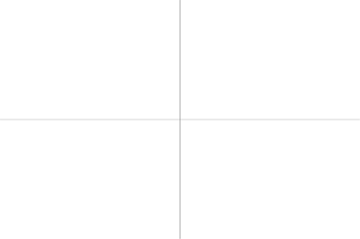
This is exactly the construction used by REGIS ARS: two complete straight segments crossing at the midpoint. There are no extra thirds, diagonals, or perspective vanishing points. The proportions of the four areas change with the canvas format, but their areas remain equal.
Equal geometric areas do not necessarily have equal visual weight. A large pale wall in one quadrant and a small nearly black object in another may exert very different effects on the viewer. A grid cannot calculate these relationships by itself.
The Center Is Not Just One Thing
The geometric center is a point determined precisely by the picture’s dimensions. The perceived center of balance depends on how shapes, values, colors, contrasts, and empty areas appear to relate. The focal point is the part of the image that attracts or is intended to hold attention. These centers can coincide, but often they do not.
For example, a small dark shape on a light background may attract attention more strongly than a much larger area with little contrast. A sharply defined edge, a bright accent, or a human face can also alter the distribution of attention. Their effect cannot be inferred from the center cross alone.
The J. Paul Getty Museum describes balance in terms of the distribution of visual weight among objects, colors, textures, and space [1]. This is a useful reminder that the center cross is a tool for asking questions, not a calculator of aesthetic success.
Symmetry, Asymmetry, and Central Composition
Mirror symmetry occurs when forms on one side of an axis correspond to forms on the other. The vertical axis is especially useful for considering this relationship. Symmetrical arrangements can support impressions of stability, order, frontality, ceremony, or stillness. But a composition can also appear balanced when the two sides are similar without being mathematically identical.
Asymmetrical balance is achieved when unequal elements nevertheless create a convincing whole. A large area of subdued color may be balanced by a smaller and more contrasting shape. The aim is not to count equal numbers of objects on either side but to evaluate their visual relationships.
Central composition is not synonymous with symmetry. A central figure may be surrounded by uneven lighting, unequal props, and irregular negative spaces. Conversely, a symmetrical picture can contain several competing points of interest instead of one dominant subject.
The horizontal axis has value too, but it is not a universal horizon line. A painted horizon can occur at any height; a portrait’s eyes do not have to align with it. The cross describes the picture’s geometry, not the anatomy or perspective of the subject.
Two Works of Art Worth Examining
In Leonardo da Vinci’s Last Supper (approximately 1495–1498), Christ is the central figure. The work’s museum in Milan states that the perspective vanishing point lies near Christ’s right temple [2]. Architectural directions and the grouping of figures contribute to a strong central organization. However, a perspective vanishing point is not automatically identical to the exact intersection of the canvas’s two midpoint axes. Leonardo’s painting is an instructive example of purposeful central composition, not evidence that he used the specific REGIS ARS overlay.
A different example is Carmen Herrera’s painting Equilibrio (2012). The Metropolitan Museum of Art describes its composition as symmetrical and emphasizes the interplay of black and white positive and negative shapes [3]. This work invites us to look beyond the bare presence of an axis and consider how contrast and the relationship between filled and empty forms shape the experience of balance.
These works differ enormously in subject and technique, yet both demonstrate that the role of the center depends on actual forms and visual relationships. Placing a cross over a picture does not, by itself, explain the composition.
In Practice: Portraits and Figures
In portraiture, the central vertical line can help the painter assess the placement of the head, shoulders, and full figure relative to the frame. A frontal portrait need not be perfectly mirror-symmetrical. Natural facial asymmetry, head position, illumination, and shadow frequently contribute to its character.
It is especially important not to confuse the centerline of the canvas with the anatomical midline of the face. If the head tilts or turns, its orientation in perspective may differ entirely from the vertical axis of the picture. The cross shows where the figure sits in the frame; it does not prescribe facial proportions.
For a sitter looking to one side, try two versions: one with the face near the center, another allowing more space in the direction of the gaze. Evaluate the result by looking at the sitter’s relationship with the background, the emotional impression, and the meaningful use of negative space, rather than distance from a guide line.
In Practice: Still Life, Landscape, and Architecture
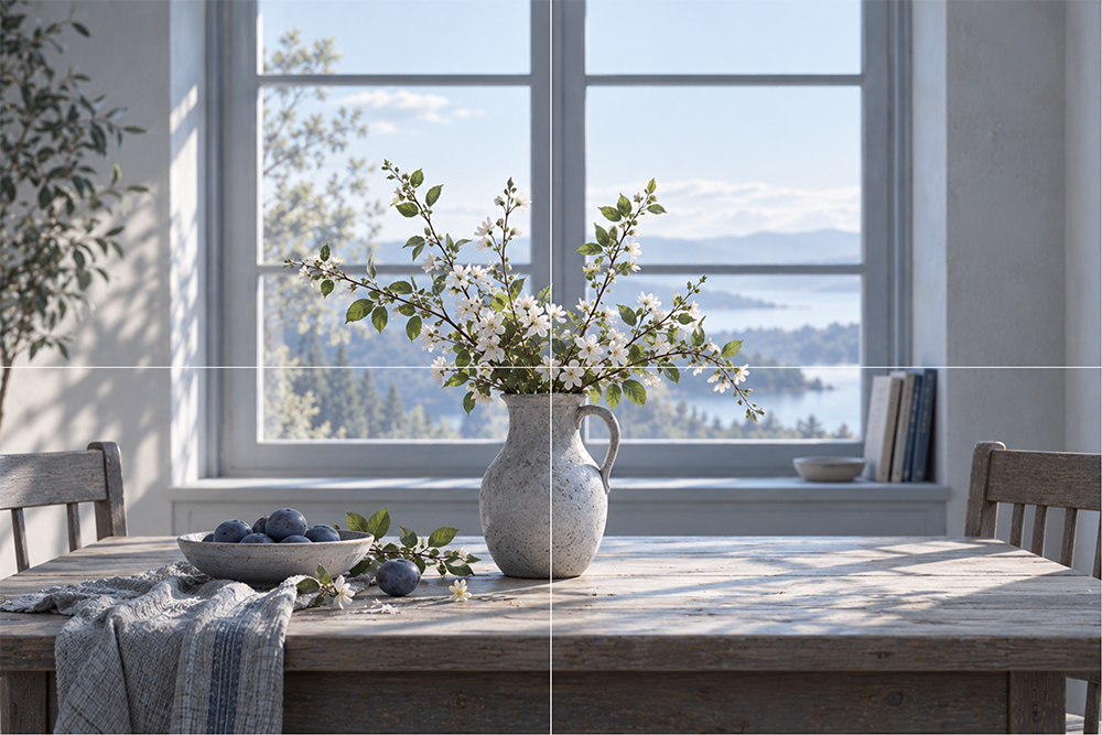
Still life. Arrange three objects of different sizes so that the main group falls near the intersection. Then move a small dark or brightly colored object toward an edge. Notice how strongly one apparently minor adjustment can change the balance. The cross is particularly useful for comparing a purposeful empty area with space that merely feels neglected.
Landscape. Use the cross to compare the proportions of sky and land and the distribution of major light and dark masses. A horizon on the horizontal axis divides the height evenly, but that is not inherently better or worse than a high or low horizon. A landscape dominated by an expressive sky might require much more room above the horizon.
Architecture. A frontal view of a façade may have a structural symmetry axis that coincides with the picture’s vertical midpoint. In an oblique view, however, actual perspective and the visible shapes matter far more than an easy alignment with the center of the canvas.
Limitations and Research
Rudolf Arnheim devoted considerable attention to centers, frames, and perceived balance in visual art. His influential book The Power of the Center was first published in 1982 [4]. It is a serious theoretical exploration, not evidence that every successful picture must place its principal subject at the exact middle.
A study by McManus, Stöver, and Kim (2011) examined some predictions of Arnheim’s theory of visual balance. Although certain statistical patterns emerged, several more tightly controlled experiments did not support the predicted effect [5]. The researchers did not test the Center Cross overlay itself. Their findings should therefore not be used as direct proof for or against the usefulness of this particular guide.
A more defensible conclusion is that an axis can help artists analyze a decision, while perceived balance and aesthetic quality must still be judged through actual values, colors, shapes, edges, and spaces.
Practical Exercise: Five Versions of One Motif
Choose a simple three-object still life or a portrait reference. Work in the same 60 × 40 cm format and make five small studies, initially using a center cross. Keep the overall value structure broadly comparable so placement differences are easier to observe.
- Central arrangement. Place the most important object or group near the intersection.
- Vertical symmetry. Aim for broadly corresponding silhouettes on the left and right.
- Asymmetrical balance. Counter a large subdued form with a smaller, stronger accent.
- An empty center. Move the focal subject aside and let the intersection fall within negative space.
- Free adjustment. Hide the guide and change whatever interferes with the artistic intention.
Compare where your gaze lands first, how the visual weight seems distributed, whether the negative space contributes to the picture, and which arrangement best conveys the intended mood. There is no requirement for the central or symmetrical version to win.
Conclusion
The Center Cross identifies the exact midpoint of a picture and divides it into four equal-area regions. But a centered object need not be the primary focal point, and a symmetrical arrangement does not guarantee convincing visual balance.
Its most useful question is a simple one: what is really at the center of this picture, and why? The answer may involve an object, an interval of space, a contrast, a rhythm, or a deliberate choice to leave the geometric center unoccupied. The cross helps reveal the choice; the painter makes it.
Sources and Further Reading
[1] J. Paul Getty Museum. Understanding Formal Analysis: Principles of Design. Definitions of visual balance, symmetry, and asymmetry.
[2] Museo del Cenacolo Vinciano, Milan. A Powerful Theatrical Machine. Official analysis of perspective in Leonardo’s Last Supper.
[3] The Metropolitan Museum of Art. Carmen Herrera, Equilibrio (2012). Collection entry.
[4] Arnheim, Rudolf. The Power of the Center: A Study of Composition in the Visual Arts. University of California Press, 1982; 20th-anniversary edition, 2009.
[5] McManus, I. C., Stöver, K., and Kim, D. Arnheim’s Gestalt Theory of Visual Balance: Examining the Compositional Structure of Art Photographs and Abstract Images. i-Perception, 2(6), 2011, pp. 615–647.