

The Phi Grid: An Expanded Golden-Ratio Framework
The phi grid is a geometric aid for analyzing composition based on the golden ratio. It offers a way to divide the picture plane into bands of unequal width and examine relationships among them. This kind of framework may help artists assess the placement of major forms, boundaries between value masses, spacing between objects, and visual rhythm.
It is important to distinguish two things from the outset: mathematically defined line positions and artistic decisions. The positions of the lines can be calculated objectively. Whether those lines help a particular picture depends on the artistic intention, subject, and overall visual organization.
Why “phi grid” does not always mean the same thing
In photography and popular composition guides, a phi grid often refers to a simple four-line overlay: two vertical and two horizontal lines at approximately 38.2% and 61.8% of each dimension. This is essentially a golden-ratio placement grid, similar in appearance to a rule-of-thirds overlay but with a narrower central band [3].
This article examines an expanded phi grid. It consists of six vertical and six horizontal lines. Four additional symmetrically placed lines are added to the divisions at 38.2% and 61.8%, using further subdivisions derived from the same golden-ratio relationship. This specific construction is the one implemented among the composition guides in REGIS ARS.
That does not establish a single, historically universal twelve-line phi-grid tradition. Different artists or software tools may construct different expanded grids. The line positions should therefore be specified whenever an expanded phi grid is discussed.
The mathematical basis
The golden ratio is represented by the Greek letter φ (phi):
φ = (1 + √5) / 2 ≈ 1.6180339887
Its reciprocal is 1/φ ≈ 0.618034. The complementary proportion is 1/φ² ≈ 0.381966. Both values follow directly from the identity φ² = φ + 1 [1, 2].
For convenience, let p = 1/φ ≈ 0.618034 and q = 1 − p ≈ 0.381966. The primary golden-ratio pair lies at q and p. In the expanded grid, further divisions at q² and qp are introduced in the outer portions of each dimension, with matching positions reflected around the center.
Measured from the left edge of an image of width W, the vertical coordinates are:
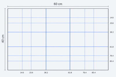
x/W = q²; qp; q; p; 1 − qp; 1 − q²
As percentages, rounded to three decimal places, these become:
14.590% · 23.607% · 38.197% · 61.803% · 76.393% · 85.410%
Horizontal lines use exactly the same relative positions measured downward from the top edge, substituting the picture height H. The resulting layout is symmetrical about both central axes of the picture.
How many regions does it create?
Six vertical lines divide the image width into seven bands, and six horizontal lines divide its height into seven bands. Together they produce 49 rectangular regions and 36 interior intersection points.
The bands are not equal in width. From left to right, their approximate proportions are 14.590%, 9.017%, 14.590%, 23.607%, 14.590%, 9.017%, and 14.590%. The same sequence describes the horizontal divisions.
A distinctive feature is the relatively broad central band and the symmetrical rhythm of the surrounding divisions. The grid does not give all 49 regions equal artistic significance. More lines simply provide more potential reference positions, not more obligatory compositional rules.
Worked example: a 60 × 40 cm canvas
For a canvas 60 cm wide, the vertical guides fall approximately 8.75, 14.16, 22.92, 37.08, 45.84, and 51.25 cm from the left edge.
For a canvas 40 cm high, the horizontal guides fall approximately 5.84, 9.44, 15.28, 24.72, 30.56, and 34.16 cm from the top edge.
This canvas is not itself a golden rectangle: its aspect ratio is 60:40 = 1.5, whereas the golden rectangle has an aspect ratio of approximately 1.618:1. The phi-grid divisions can be applied to a picture of any aspect ratio; using the grid does not transform the outer format into a golden rectangle.
For accurate construction, calculate each guide from the original width or height rather than successively rounding intermediate band widths. Repeated rounding may accumulate small errors.
How to read the grid without getting lost in the lines
An expanded phi grid may look rather dense, particularly to beginners. It is more useful when considered in stages.
First level: primary divisions. Start with the 38.2% and 61.8% lines. They may already help clarify the relationship between the principal visual areas. If the compositional question is simple, the additional lines may offer no benefit.
Second level: subdivisions near the edges. The extra lines at approximately 14.6%, 23.6%, 76.4%, and 85.4% provide more reference positions for evaluating margins, the extent of secondary forms, and negative space.
Third level: intersections. Intersection points may be useful for checking the placement of a focal detail or the relationship of several forms. There is no need to use all 36. They are not 36 competing focal points.
Begin by observing the picture without an overlay. Switch on the grid only to test whether it clarifies a specific compositional decision. If the lines merely distract, they are not helping.
Applications in different painting genres
Still life: object groups and spacing
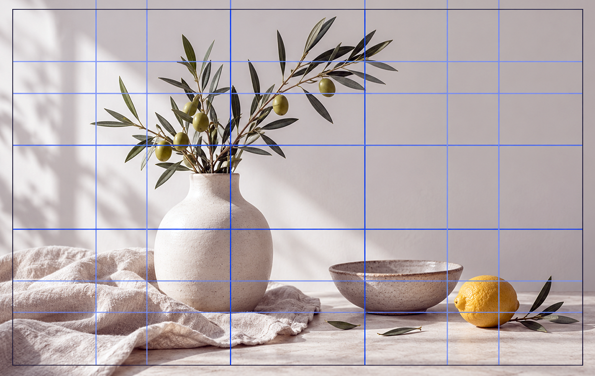
In still-life painting, begin with the overall silhouette of the objects as a group. A primary vertical line can serve as a possible reference for the main object, while secondary lines near the edges may help evaluate the group’s boundaries and the surrounding space.
For example, a tall vessel might be placed near a principal golden-ratio line, with a small fruit nearer an outer subdivision. This is only one possibility. If the shadow mass or a light drapery shape changes the distribution of visual weight, the same geometric arrangement may no longer work.
Landscape: major areas and rhythm
In a landscape, a primary horizontal line may suggest a possible horizon level or division between major landforms. The additional lines can help compare bands of sky, distant planes, or forms in the foreground.
There is no reason to attach every hill, tree, and cloud to a different guide. Natural structure, perspective, and value relationships matter more than making use of every available line.
Portrait: the figure and negative space
In portraiture, the grid may help assess where the head or figure sits within the overall frame, including the space at the sides and in the direction of the sitter’s gaze.
It should not be used as a universal measurement system for human facial anatomy. Facial features vary among individuals and change in appearance with viewpoint, illumination, and perspective. A compositional overlay should not distort the sitter’s likeness.
Comparing the phi grid with other guides
The Rule of Thirds places its guides at approximately 33.3% and 66.7% of each dimension. It is a simple, easily remembered division.
The Golden Ratio guide uses 38.2% and 61.8%. These guides sit closer to the center than the lines in a thirds grid.
The expanded Phi Grid retains those primary golden-ratio guides but adds four more in each direction. It offers a more detailed way to analyze relationships, not a guarantee of greater mathematical or aesthetic correctness.
A golden rectangle refers to an outer rectangle with an aspect ratio of φ:1. A golden spiral is a separate curved construction. Neither is synonymous with an expanded phi grid [1].
History: distinguishing documented mathematics from assumed practice
The golden-ratio relationship has a well-documented place in classical geometry. Euclid’s Elements describes division in extreme and mean ratio, providing the mathematical foundation for later constructions [1, 2].
This does not imply that every modern expanded grid was devised by the ancient Greeks, Renaissance painters, or any particular famous artist. No historical authorship is claimed here for this specific twelve-line configuration. It is a precisely defined practical application of a mathematical proportion.
An overlay with many lines is especially likely to produce some visible coincidences when placed on a historical painting. To establish that the painter intentionally used that exact framework, one would need credible evidence such as preparatory drawings, working notes, or independent historical documentation. A visual match alone is insufficient.
Does a denser grid make a painting more beautiful?
There is no basis for claiming that this particular arrangement of six vertical and six horizontal lines automatically improves aesthetic quality. Research on golden-ratio proportions more generally has produced mixed results, and those findings cannot be assumed to validate every specific grid design.
For instance, experiments published in 2015 using images of artworks did not establish a clear automatic aesthetic preference for subjects positioned according to the golden ratio [4]. Other studies have found that instructions, context, and the range of proportions being compared may affect preferences [5].
For a working artist, the most useful question is whether a grid helps reveal or solve a compositional problem that was otherwise difficult to see. If not, there is no obligation to use it.
Practical exercise: one still life, three analyses
Arrange a still life with three or four objects. Make three small studies of identical format, keeping the viewpoint and lighting as consistent as possible.
- Without a grid. Establish an arrangement based on the overall silhouette, value masses, and negative space.
- Using the primary golden-ratio guides. Draw the four lines at 38.2% and 61.8%. Test whether they help clarify the placement of the principal group.
- Using the expanded phi grid. Add the subdivisions at 14.6%, 23.6%, 76.4%, and 85.4%. Use them to address one particular question, such as the margin beside a group or the location of a secondary object.
Compare the clarity of the focal area, overall silhouette, negative spaces, and distribution of light and dark—not the number of objects that happen to touch a guide. The strongest version may be the first, made without a grid. That is a perfectly valid outcome.
Conclusion
The expanded phi grid is a precisely calculated, symmetrical framework derived from the golden ratio. Its twelve guide lines offer additional positions for examining the structure of a picture plane, but they do not turn composition into a mathematical problem with a single correct solution.
Start with the overall image, examine the main golden-ratio divisions, and consult the finer subdivisions only when they serve a clear purpose. In painting, geometry should support observation and artistic judgment—not replace them.
Sources and further reading
[1] Weisstein, Eric W. Golden Ratio. Wolfram MathWorld. Mathematical definition and identities.
[2] O’Connor, J. J., Robertson, E. F. The Golden Ratio. MacTutor History of Mathematics, University of St Andrews. Historical context for the mathematics.
[3] Pavlov Studios. Golden Ratio Photography Composition Guide (2026). Example of the common four-line “phi grid” usage in photography; not evidence for the historical origin of an expanded grid.
[4] Stieger, S., Swami, V. Time to let go? No automatic aesthetic preference for the golden ratio in art pictures. Psychology of Aesthetics, Creativity, and the Arts, 9(1), 91–100 (2015).
[5] Russell, P. A. The aesthetics of rectangle proportion: effects of judgment scale and context. American Journal of Psychology, 113(1), 27–42 (2000).